













In the park of the palace of Versaille, where all things conform to an ordered, symmetrical fantasy, there is a corner of rustic asymmetry - though no less fantastic than the rest. This pocket-handkerchief collection of buildings includes a cottage with an attached watermill (below), a barn and a dairy. It is known as Hameau de la Reine (the Queen's hamlet), and was purpose-built in the 1780's to allow Marie Antoinette to indulge her pastorale fantasies. In a time when the aloof aristocracy considered that to pretend to be a hard-working peasant was quite the most charming thing, the Queen would retire with her ladies-in-waiting to Hameau, dress themselves as dairymaids and shepherdesses, and milk cows suitably chosen for their docility using custom-made porcelain pails emblazoned with the Queen's monogram.
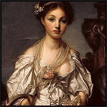
 It was against this indulgent social backdrop that the artist Jean-Baptiste Greuze formed his career. While sojourning in Italy, Greuze fell in love with a countess who was one of his pupils. But with his love apparently unrequited, he returned to Paris and instead married the daughter of a bookseller. As his willing and available model, the young Anne-Gabrielle seems to have been an artist's dream come true, for not only did she possess a face which typified the ideal beauty of the time (The White Hat, below), but by using her as his costumed subject, Greuze could exploit the prevailing aristocratic taste for portrayals of a sham and impossibly romanticised pastoral life.
 It was this bookseller's daughter who inspired the two works for which the artist is now best known. The Milkmaid (below) is pure charade. The satin dress is hardly authentic farm attire, and the delicate hand which loosely holds the milk ladle clearly has seen little of hard work. The ladle, and even the pony with its wicker baskets, are no more than props in a piece of contrived theatre in which this sham dairymaid is the featured actress. But with her dairymaids-are-easy pose and her come-hither eyes, she reached an audience who themselves were indulging in the same fantasies, and so were willingly convinced.
 With The Broken Pitcher (below), we see the same subterfuge at work. Anne-Gabrielle, again clothed in satin, was no more likely to have fetched water from the local fountain than she was accustomed to struggle up at four in the morning to milk the lowing herd. But with this subject there is an added frisson of eroticism in the evident (to use today's ludicrously coy term) wardrobe malfunction, and in the pitcher's symbolic suggestion of shattered virginity. This symbolism is enhanced by the position of the clutched hands, and by the blooms cradled in the folds of the dress that will not now receive the water which they need to remain fresh.
 When we become aware of these included elements, the seemingly-innocent escapism of The Broken Pitcher gains a darker and more forceful dimension (the detail, below). Seen in this light, it is not so much a portrayal of beauty, as it is of beauty despoiled; not so much a picture of innocence, as of innocence lost. But whose? By all accounts, Anne-Gabrielle was anything but the demure creature that she seems from her husband's canvasses. Rather, her extra-marital sexual escapades, which she apparently took no precaution to conceal either from her husband or from society in general, seem to have driven the artist to despair. Poor Jean-Baptiste. Disillusioned with his marriage, and also with the critique which his attempts at classical subjects prompted from the then all-powerful French Art Academy. Even the small fortune which his successful works generated was squandered by the extravagant frivolities of his wife. But worse was to follow.
 To play at being servants and farm labourers when the real labourers were starving was, of course, a recklessly immoral indulgence. A few short years later, the Revolution came to Marie Antoinette's make-believe farm in the palace grounds, and the queen, abandoning her porcelain milk pails and her fragile fantasies, was led away to the guillotine. Unlike the queen and many of her social standing, Greuze avoided losing his head. But he did lose everything else. At age 76 he found himself destitute, with his art being rejected as superficial, sentimental and - that most damning of French adjectives - bourgeois. Jean-Baptiste Greuze died four years later, and was buried with only two mourners in attendance.
 Greuze' art went from fashionable demand to scornful rejection, both during his own lifetime and beyond. It seems that only with a certain historical distance can we now see that he in fact succeeded in capturing a specific spirit of his time. That such a spirit had drifted away from harsh social realities was nevertheless something which the artist portrayed in his canvasses, and with hindsight becomes a valid historical statement in itself. And his portrayals of his wife (detail of The White Hat, above) offer images that are at the same time both innocent and coquettish, capricious and mysterious, aloof and alluring, and ultimately enigmatic. And that is art enough.
 Well, I had thought to end this particular post with the above statement, but then discovered that New York's Frick Collection has a pastel portrait (detail, above, and below) of Anne-Gabrielle which Greuze painted ten years after The White Hat. Ten years can be a long time in a marriage. A world of difference separates the Anne-Gabrielle portrayed in The White Hat from the Madame Baptiste of 1790.
 By 1790 the Revolution had already begun, and the social landscape which formed the basis of Greuze' art was being swept away. But it is the domestic transformation which marks Anne-Gabrielle's expression here. The mystic porcelain beauty of ten years earlier has vanished. In her place Greuze now shows a woman of resigned and weary irony. The sad disillusionment which guided the artist's hand does not make for a comfortable viewing of this sardonic portrait, but it does demonstrate Greuze' accomplishment, both artistic and human, in capturing the painful emotions of his failed relationship. Three years after Greuze painted this bittersweet portrait, and 34 years after he and Anne-Gabrielle married, the couple were finally divorced.

Artist; Jean-Baptiste Greuze
Work: The White Hat, 1780
Medium: Oils
Location: The Museum of Fine Arts, Boston
Artist; Jean-Baptiste Greuze
Work: The Milkmaid, ca. 1770
Medium: Oils
Location: The Louvre, Paris
Artist; Jean-Baptiste Greuze
Work: The Broken Pitcher, 1771
Medium: Oils
Location: The Louvre, Paris
Artist; Jean-Baptiste Greuze
Work: Madame Baptiste, 1790
Medium: Pastels
Location: The Frick Collection, New York
Sources:
The World's Greatest Paintings, Vol. 1, ed. by T. Leman Hare. Odhams Press, Ltd. 1936
Eccentric Spaces, by Robert Harbison. André Deutsch, Ltd. 1977 (for the material about Hameau). Additional biographical information from The Wallace Collection database.
Scan of The White Hat: Harrick. Digitally restored scans of The Milkmaid and The Broken Pitcher: Hawkwood. Madame Baptiste image: The Frick Collection.
 It was against this indulgent social backdrop that the artist Jean-Baptiste Greuze formed his career. While sojourning in Italy, Greuze fell in love with a countess who was one of his pupils. But with his love apparently unrequited, he returned to Paris and instead married the daughter of a bookseller. As his willing and available model, the young Anne-Gabrielle seems to have been an artist's dream come true, for not only did she possess a face which typified the ideal beauty of the time (The White Hat, below), but by using her as his costumed subject, Greuze could exploit the prevailing aristocratic taste for portrayals of a sham and impossibly romanticised pastoral life.
 It was this bookseller's daughter who inspired the two works for which the artist is now best known. The Milkmaid (below) is pure charade. The satin dress is hardly authentic farm attire, and the delicate hand which loosely holds the milk ladle clearly has seen little of hard work. The ladle, and even the pony with its wicker baskets, are no more than props in a piece of contrived theatre in which this sham dairymaid is the featured actress. But with her dairymaids-are-easy pose and her come-hither eyes, she reached an audience who themselves were indulging in the same fantasies, and so were willingly convinced.
 With The Broken Pitcher (below), we see the same subterfuge at work. Anne-Gabrielle, again clothed in satin, was no more likely to have fetched water from the local fountain than she was accustomed to struggle up at four in the morning to milk the lowing herd. But with this subject there is an added frisson of eroticism in the evident (to use today's ludicrously coy term) wardrobe malfunction, and in the pitcher's symbolic suggestion of shattered virginity. This symbolism is enhanced by the position of the clutched hands, and by the blooms cradled in the folds of the dress that will not now receive the water which they need to remain fresh.
 When we become aware of these included elements, the seemingly-innocent escapism of The Broken Pitcher gains a darker and more forceful dimension (the detail, below). Seen in this light, it is not so much a portrayal of beauty, as it is of beauty despoiled; not so much a picture of innocence, as of innocence lost. But whose? By all accounts, Anne-Gabrielle was anything but the demure creature that she seems from her husband's canvasses. Rather, her extra-marital sexual escapades, which she apparently took no precaution to conceal either from her husband or from society in general, seem to have driven the artist to despair. Poor Jean-Baptiste. Disillusioned with his marriage, and also with the critique which his attempts at classical subjects prompted from the then all-powerful French Art Academy. Even the small fortune which his successful works generated was squandered by the extravagant frivolities of his wife. But worse was to follow.
 To play at being servants and farm labourers when the real labourers were starving was, of course, a recklessly immoral indulgence. A few short years later, the Revolution came to Marie Antoinette's make-believe farm in the palace grounds, and the queen, abandoning her porcelain milk pails and her fragile fantasies, was led away to the guillotine. Unlike the queen and many of her social standing, Greuze avoided losing his head. But he did lose everything else. At age 76 he found himself destitute, with his art being rejected as superficial, sentimental and - that most damning of French adjectives - bourgeois. Jean-Baptiste Greuze died four years later, and was buried with only two mourners in attendance.
 Greuze' art went from fashionable demand to scornful rejection, both during his own lifetime and beyond. It seems that only with a certain historical distance can we now see that he in fact succeeded in capturing a specific spirit of his time. That such a spirit had drifted away from harsh social realities was nevertheless something which the artist portrayed in his canvasses, and with hindsight becomes a valid historical statement in itself. And his portrayals of his wife (detail of The White Hat, above) offer images that are at the same time both innocent and coquettish, capricious and mysterious, aloof and alluring, and ultimately enigmatic. And that is art enough.
 Well, I had thought to end this particular post with the above statement, but then discovered that New York's Frick Collection has a pastel portrait (detail, above, and below) of Anne-Gabrielle which Greuze painted ten years after The White Hat. Ten years can be a long time in a marriage. A world of difference separates the Anne-Gabrielle portrayed in The White Hat from the Madame Baptiste of 1790.
 By 1790 the Revolution had already begun, and the social landscape which formed the basis of Greuze' art was being swept away. But it is the domestic transformation which marks Anne-Gabrielle's expression here. The mystic porcelain beauty of ten years earlier has vanished. In her place Greuze now shows a woman of resigned and weary irony. The sad disillusionment which guided the artist's hand does not make for a comfortable viewing of this sardonic portrait, but it does demonstrate Greuze' accomplishment, both artistic and human, in capturing the painful emotions of his failed relationship. Three years after Greuze painted this bittersweet portrait, and 34 years after he and Anne-Gabrielle married, the couple were finally divorced.
Artist; Jean-Baptiste Greuze
Work: The White Hat, 1780
Medium: Oils
Location: The Museum of Fine Arts, Boston
Artist; Jean-Baptiste Greuze
Work: The Milkmaid, ca. 1770
Medium: Oils
Location: The Louvre, Paris
Artist; Jean-Baptiste Greuze
Work: The Broken Pitcher, 1771
Medium: Oils
Location: The Louvre, Paris
Artist; Jean-Baptiste Greuze
Work: Madame Baptiste, 1790
Medium: Pastels
Location: The Frick Collection, New York
Sources:
The World's Greatest Paintings, Vol. 1, ed. by T. Leman Hare. Odhams Press, Ltd. 1936
Eccentric Spaces, by Robert Harbison. André Deutsch, Ltd. 1977 (for the material about Hameau). Additional biographical information from The Wallace Collection database.
Scan of The White Hat: Harrick. Digitally restored scans of The Milkmaid and The Broken Pitcher: Hawkwood. Madame Baptiste image: The Frick Collection.


