


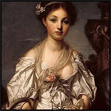


In the closing years of the fifteenth century the city of Florence was home to an unlikely artists' partnership. Fra Bartolomeo was, as his name suggests, a simple-living and pious Dominican monk, gentle and retiring by nature. His studio partner, on the other hand, relished his reputation as a wild and woolly party animal, as partial to the bottle - and to the Florentine ladies - as he was to the tavern which he kept that allowed him to indulge his appetite for both. His name was Mariotto Albertinelli.
 The studio co-operation of this apparently mismatched pair lasted until 1498 (The Annunciation, painted by both artists in 1497, above), when the good friar retreated to a monastery to continue working in devoted seclusion, leaving his pleasure-loving partner to complete several of his unfinished studio works. Five years after this, the congregation of Saints Martino and Elizabetta approached Albertinelli with a commission. He was asked to produce a large-scale work on the theme of the Visitation (below). Scripturally, this was the occasion related in Luke's Gospel when Elizabeth, the future mother of John the Baptist, is visited by her younger cousin Mary, the mother-to-be of Jesus. The figures of the two women in Albertinelli's composition would be life-size.
 Now, although his surviving works are competent enough, Albertinelli does not appear to have been a particularly inspired painter. But with his commission for the Visitation, the artist seems to have lifted himself beyond both all that he previously had produced and his own stormy temperament to create a work of deep and sublime tranquility. I'm also inclined to think that only Italian genius - and perhaps only Florentine genius at that - could have produced this particular combination of luminous colors. But why do Albertinelli's colors produce an effect of such intense harmony?
 When a standard color wheel is superimposed upon the scene (above), we can see that the orange of Elizabeth's robe and her olive green dress is complementary to (that is: opposite to on the wheel) the rich blue of Mary's robe and the warm red of her dress. In color theory, secondary green is complementary to primary red, and secondary orange is complementary to primary blue. In Albertinelli's composition, these colors circle around each other in a kind of dance in the costumes of the two women. Where the colors appear in the artist's composition is as critical as the colors themselves.
 The elder of the two cousins leans forward to kiss her visitor in greeting (the detail, above). This simple gesture of affection, which is the whole focus of the painting, is dramatised by the background architecture. Hardly intended as a realistic building, Albertinelli deploys his background as if it were a stage set, the single arch with its Renaissance columns echoing the altarpiece curve of the painting's shape. The artist creates a perfect symmetry: the top of the painting itself and the columned arch share the same center (below), which circle also contains the action of the two women as they lean towards each other in greeting.
 Well, all of the above having been said, any amount of color theory and compositional analysis is in the end not enough to explain, not only why the painting as a whole is such an unquestioned masterpiece, nor even why it is so dramatically better than this artist's other works. How is it possible that an artist notorious for his erratic and fiery temper, his drinking, and his dedicated pursuit of the pleasures of the flesh, nevertheless produced a work of such intense sublimity? Perhaps something of the spirit of his former pious friend and studio partner remained with him. Or perhaps he had his own visitation of the spirit, inexpressible in words, but able to be glimpsed through his one supreme masterwork.

Artist: Mariotto Albertinelli
Work: The Visitation, 1503
Medium: Oils
Location: Galleria degli Uffizi, Florence
Sources:
The World's Greatest Paintings, Vol. 1, ed. T. Leman Hare. Odhams Press, Ltd. 1936
Scans from the Web Gallery of Art (see my sidebar links). Superimposed color wheel element by Don Jusko at colorwheel dot com. Analysis graphics by Hawkwood.
 The studio co-operation of this apparently mismatched pair lasted until 1498 (The Annunciation, painted by both artists in 1497, above), when the good friar retreated to a monastery to continue working in devoted seclusion, leaving his pleasure-loving partner to complete several of his unfinished studio works. Five years after this, the congregation of Saints Martino and Elizabetta approached Albertinelli with a commission. He was asked to produce a large-scale work on the theme of the Visitation (below). Scripturally, this was the occasion related in Luke's Gospel when Elizabeth, the future mother of John the Baptist, is visited by her younger cousin Mary, the mother-to-be of Jesus. The figures of the two women in Albertinelli's composition would be life-size.
 Now, although his surviving works are competent enough, Albertinelli does not appear to have been a particularly inspired painter. But with his commission for the Visitation, the artist seems to have lifted himself beyond both all that he previously had produced and his own stormy temperament to create a work of deep and sublime tranquility. I'm also inclined to think that only Italian genius - and perhaps only Florentine genius at that - could have produced this particular combination of luminous colors. But why do Albertinelli's colors produce an effect of such intense harmony?
 When a standard color wheel is superimposed upon the scene (above), we can see that the orange of Elizabeth's robe and her olive green dress is complementary to (that is: opposite to on the wheel) the rich blue of Mary's robe and the warm red of her dress. In color theory, secondary green is complementary to primary red, and secondary orange is complementary to primary blue. In Albertinelli's composition, these colors circle around each other in a kind of dance in the costumes of the two women. Where the colors appear in the artist's composition is as critical as the colors themselves.
 The elder of the two cousins leans forward to kiss her visitor in greeting (the detail, above). This simple gesture of affection, which is the whole focus of the painting, is dramatised by the background architecture. Hardly intended as a realistic building, Albertinelli deploys his background as if it were a stage set, the single arch with its Renaissance columns echoing the altarpiece curve of the painting's shape. The artist creates a perfect symmetry: the top of the painting itself and the columned arch share the same center (below), which circle also contains the action of the two women as they lean towards each other in greeting.
 Well, all of the above having been said, any amount of color theory and compositional analysis is in the end not enough to explain, not only why the painting as a whole is such an unquestioned masterpiece, nor even why it is so dramatically better than this artist's other works. How is it possible that an artist notorious for his erratic and fiery temper, his drinking, and his dedicated pursuit of the pleasures of the flesh, nevertheless produced a work of such intense sublimity? Perhaps something of the spirit of his former pious friend and studio partner remained with him. Or perhaps he had his own visitation of the spirit, inexpressible in words, but able to be glimpsed through his one supreme masterwork.
Artist: Mariotto Albertinelli
Work: The Visitation, 1503
Medium: Oils
Location: Galleria degli Uffizi, Florence
Sources:
The World's Greatest Paintings, Vol. 1, ed. T. Leman Hare. Odhams Press, Ltd. 1936
Scans from the Web Gallery of Art (see my sidebar links). Superimposed color wheel element by Don Jusko at colorwheel dot com. Analysis graphics by Hawkwood.
Well done, I was very impressed with your graphics.
ReplyDeleteDon Jusko
http://www.realcolorwheel.com/colorwheel.htm
Thank you, Don. Coming from you that means a lot!
ReplyDeleteHi interesting analysis!
ReplyDeletei have seen your message on youtube so decided to follow you here
debbje on youtube